How to Improve Website Usability for More Leads
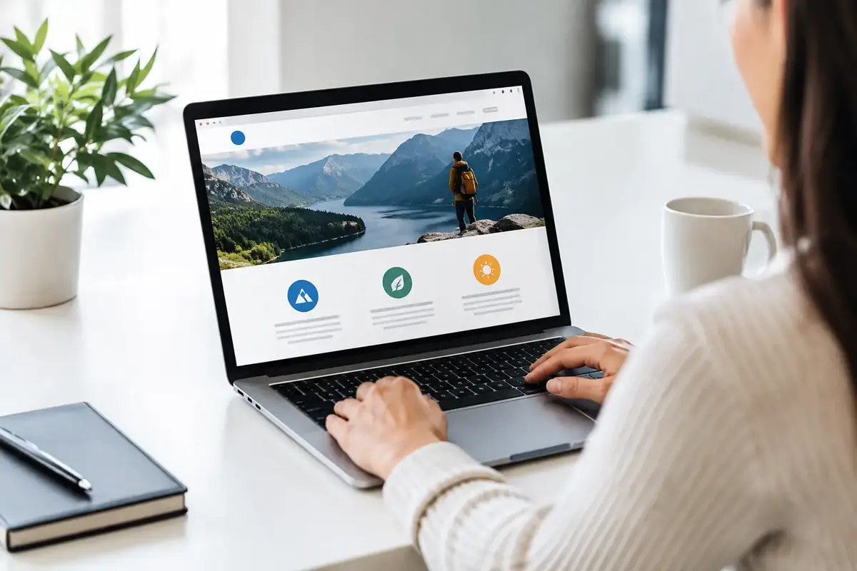
A visitor lands on your website, needs a quote, and cannot tell where to click next. They try the menu, scroll past a wall of text, tap a tiny phone number, then leave. That is not a traffic problem. It is a usability problem.
To improve website usability, focus on removing the friction between a customer's question and the action you want them to take. For a Bay Area small business, that usually means making it easier to understand what you do, trust you, contact you, and get an answer without waiting until Monday morning.
A polished site is useful. A site that helps real customers book, call, request an estimate, or buy is better. Here is where to start.
Start With the Customer's Actual Job
Usability is not about adding more features. It is about helping visitors complete a task with minimal effort. A homeowner looking for an electrician wants to know whether you serve their area, what kind of work you handle, whether you are credible, and how to get help. They do not need a long company history before they see a way to contact you.
Every important page should answer four questions quickly: What do you offer? Who is it for? Why should someone trust you? What should they do next?
This is where many small-business websites lose leads. The copy is often written from the owner's point of view rather than the customer's. Phrases such as “quality solutions” and “customer-focused service” sound fine, but they do not tell a visitor what will happen when they call.
Use plain language instead. A plumbing company might say, “Same-day repair appointments for leaks, clogs, and water heater issues in San Jose.” That gives the customer a service, a timeline, and a location in one line.
Make the First Screen Earn Its Place
The top section of a page has one job: orient the visitor and give them a clear next step. It does not need a slideshow, an autoplay video, or a clever headline that makes people work to understand it.
Lead with a specific statement of value, then support it with a short explanation and one primary call to action. If booking is the goal, use “Book an Appointment.” If estimates are the goal, use “Request a Free Estimate.” “Learn More” can work for supporting content, but it is weak when someone is ready to act.
Keep the primary action consistent. If your home page says “Get a Quote,” your services page says “Contact Us,” and your contact page says “Start Here,” visitors have to decode your process at every turn. Choose the language that fits your business and repeat it.
Trust belongs near the decision point, too. Reviews, service-area details, licensing information, recognizable client logos, before-and-after work, or a short explanation of your process can reduce hesitation. The right proof depends on your business. A local contractor may benefit most from project photos and license details, while a professional service firm may need testimonials and a clear explanation of confidentiality or credentials.
Improve Website Usability on Mobile First
Most local service searches begin on a phone. If your site was designed around a desktop layout and squeezed down later, customers will notice. Small text, crowded navigation, buttons too close together, and forms that are painful to complete all create reasons to leave.
Test your site on an actual phone, not only in a browser preview. Can you find the phone number without pinching and zooming? Can you reach the main service pages in one or two taps? Can you submit a form with one hand? Does the main call to action stay visible when it matters?
Mobile usability also means respecting the context of a mobile visitor. Someone may be standing in a store, sitting in their car, or dealing with a broken appliance. Give them fast paths to call, text, request service, or ask a question. Do not force them through a five-step process just to reach a human.
A sticky call or booking button can be effective for appointment-based businesses, but only when it does not cover important content or turn the screen into a cluttered control panel. The goal is useful access, not constant interruption.
Simplify Navigation and Page Structure
Your navigation is a map, not an archive of every page your company has ever published. A service business usually needs a small set of obvious choices: Services, About, Reviews or Work, Service Areas if relevant, and Contact. Ecommerce businesses need clear product categories, search, account access, and a cart that remains easy to find.
Avoid vague menu labels such as “Solutions,” “Resources,” or “Explore” unless the meaning is obvious in context. Customers should not have to guess whether “Solutions” means repair services, software, consulting, or financing.
Within a page, organize information in the order customers need it. Start with the offer and the next action. Then explain the service, address common concerns, provide proof, and offer another opportunity to contact you. This approach works because it supports both fast decision-makers and visitors who need more confidence before reaching out.
Long pages are not automatically bad. A detailed page can rank well and answer serious buyer questions. The problem is unstructured length. Use meaningful headings, short paragraphs, clear visual separation, and direct calls to action so readers can scan without getting lost.
Treat Speed as Part of the Customer Experience
A slow site makes a business look less dependable, even when the work itself is excellent. Every oversized image, unnecessary animation, pop-up, third-party script, and bloated template adds weight. On a strong office connection, those problems may seem minor. On a phone with weak service, they can stop a customer before the page fully loads.
Prioritize fast-loading pages with properly sized images, efficient code, and only the tools your business genuinely needs. A chat tool may be worth the added load if it captures after-hours leads. A tracking script may be worthwhile if it informs better marketing decisions. But every add-on should have a business reason.
This is one advantage of custom development over a heavily modified template. A custom site can be built around the pages, functions, and customer paths you actually need instead of carrying layers of features you will never use. It is not always the lowest upfront-cost option, but it can reduce bloat and make future updates easier.
Research from Google Web Vitals confirms that page load speed directly impacts user experience and conversion rates, particularly for mobile visitors on slower connections.
Make Forms Easier to Finish
A contact form should collect enough information to help you respond, not enough to recreate a loan application. For most businesses, name, contact method, service needed, and a short message are sufficient for a first conversation.
Ask only for details your team will use. If you do not act on a budget field, remove it. If a customer does not need to select from 18 service types, reduce the choices or let them describe the issue in their own words. Required fields should be limited, clearly marked, and easy to complete on mobile.
Set expectations after submission. Tell the customer what happens next and when they can expect a response. Better yet, connect the form to an immediate confirmation, lead notification, and follow-up workflow so inquiries do not sit untouched in an inbox. A website cannot be truly user-friendly if it promises contact and the business responds three days later.
For businesses that receive repetitive questions after hours, an AI receptionist or lead-capture chatbot can help visitors get basic answers, qualify their needs, and request an appointment. It should not pretend to be a person or block access to a real one. Use it for routine work and clear handoffs, not as a barrier.
Check for Friction Before You Spend More on Marketing
More traffic will not fix a confusing website. In fact, it can make wasted ad spend more expensive. Before launching another campaign, walk through the site like a first-time customer and test the critical paths.
Look for these common issues:
- The home page does not clearly explain the service or service area.
- Important calls to action are hard to find or use inconsistent wording.
- Phone numbers are not tap-to-call on mobile.
- Forms ask for too much information or fail without clear error messages.
- Pages load slowly because of oversized media or unnecessary tools.
- Customer questions have no answer outside regular business hours.
You can also learn a great deal by reviewing real calls, emails, chat transcripts, and questions your staff hears every week. If people repeatedly ask whether you serve a city, offer a service, accept a type of payment, or have availability, the website should answer that question before they have to ask.
Build for Clarity, Then Keep Improving
Usability is not a one-time redesign checkbox. Your services change, customers develop new questions, and technology can either simplify operations or create another layer of maintenance. Review key pages regularly, test forms, check mobile behavior, and make sure your contact process still reflects how your team works.
Stack Studios approaches this work with a simple standard: clean websites, clear design, and practical systems that help small businesses respond faster. The right solution is not the one with the most features. It is the one that makes it easier for a customer to choose you and easier for your team to follow through.
Start with one customer journey this week. Try to book an appointment, request an estimate, or find an answer from your own phone. The places where you hesitate are usually the places your next customer will leave.