Landing Pages That Turn Visits Into Leads
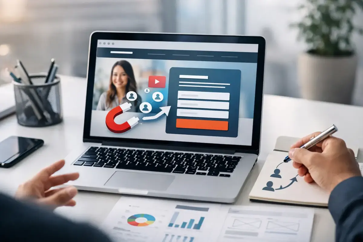
A customer clicks your ad, scans a postcard QR code, or finds your business after searching for a local service. They are interested for a few seconds. Landing pages determine whether that interest becomes a phone call, a booked appointment, or another lost opportunity.
Research from Nielsen Norman Group confirms that shorter forms significantly increase submission rates by reducing friction in the initial decision moment.
For small businesses, the goal is not a flashy page with more motion, more copy, and more choices. The goal is a focused page that gives the right visitor enough confidence to take one clear next step.
What Landing Pages Are Actually Built to Do
A homepage has a broad job. It introduces the business, explains several services, and helps different kinds of visitors find their way around. A landing page has a narrower assignment: move a specific audience toward one action.
That action might be requesting an estimate, calling for service, scheduling a consultation, claiming an offer, or joining a waitlist. The page should be built around that one outcome from the first headline through the final form.
This focus matters when you are paying for traffic. If a plumbing company runs an ad for same-day drain clearing, sending people to a general homepage forces them to hunt for the relevant service. A dedicated page can immediately say what is offered, where it is available, how quickly help is available, and how to request it.
The same principle applies to referrals, direct mail, social campaigns, and email promotions. The source may change, but the visitor should arrive at a page that matches the reason they clicked.
Start With One Audience and One Offer
The most common landing-page mistake is trying to appeal to everyone at once. Owners often want to mention every service, every neighborhood, every credential, and every promotion. Those details have value, but a page loses force when its message becomes a full company brochure.
Before writing a word, answer three practical questions: Who is arriving here? What problem are they trying to solve? What action do you want them to take now?
For example, an HVAC contractor may create one page for homeowners with an AC breakdown and another for property managers looking for ongoing maintenance. Both audiences need heating and cooling help, but they have different concerns. The homeowner wants urgency, a clear phone number, and reassurance. The property manager may need service coverage, response expectations, and a straightforward way to request a proposal.
One page does not need to carry both conversations. Separate pages usually produce clearer messages and better-qualified inquiries.
Build the Page Around the Customer's Decision
A useful landing page answers questions in the order a prospect naturally asks them. The opening screen needs to earn attention quickly, especially on a phone. State the service, the audience or location, and the practical outcome.
A weak headline says, "Quality service you can trust." It could belong to nearly any business. A stronger version says, "Same-week garage door repair in San Jose," followed by a short explanation of what the customer can expect. Specificity creates relevance. Relevance keeps people reading.
Show the offer before the company story
Your business story matters, but it should not lead the page unless your name itself is the reason someone clicked. Start with the customer need. Explain what you do, what is included, and what happens after they contact you.
Then support the promise with proof. Depending on the business, that might mean project photos, a short customer quote, licensing information, service-area details, years of experience, before-and-after examples, or a plain explanation of your process. Proof should reduce a real concern, not fill empty space.
Make the next step easy to understand
A call to action should tell people what happens when they click. "Request a free estimate" is clearer than "Submit." "Book a 15-minute consultation" is better than "Learn more" when scheduling is the actual goal.
Keep forms short enough for the value of the request. A visitor asking for an introductory consultation may reasonably provide a name, phone number, email, and a brief description of the need. Asking for a full address, budget, timeline, and ten other fields before a first conversation can reduce submissions.
There is a trade-off. Short forms create more leads, but some may be less qualified. Longer forms can filter out poor fits, but they also discourage busy customers. The right choice depends on your sales process and how quickly your team can follow up.
Mobile Speed and Trust Are Conversion Features
Most local-service visitors will see your page on a phone, often while multitasking or looking for a fast answer. If the page takes too long to load, hides its phone number, or makes the form difficult to use with a thumb, the design is working against the business.
Mobile-first design means more than shrinking a desktop layout. Buttons need room to tap. Text needs to be readable without zooming. Key information should appear early. A click-to-call option can be valuable for urgent services, while an appointment form may be better for consultations that require more planning.
Speed matters for the same reason. Heavy template features, oversized images, unnecessary pop-ups, and third-party scripts can slow the page down. A custom-built page does not automatically convert better, but it gives the business more control over what is included and what is left out. Clean code and intentional design help visitors reach the point faster.
Trust is just as practical. Use a real business name, local service area, clear contact details, and accurate claims. Do not promise response times you cannot consistently meet. If reviews, credentials, or guarantees are shown, make them relevant and easy to verify. Customers can spot generic marketing language quickly, particularly when they are deciding who to call with a real problem.
Connect the Page to What Happens After the Form
A landing page is only as useful as the follow-up behind it. If inquiries sit in an inbox until the next day, paid traffic and good design cannot recover the lost momentum.
At a minimum, every submission should reach the right person immediately and be recorded where the business can act on it. For appointment-based companies, that may include a scheduling flow and confirmation message. For service businesses, it may mean routing requests by zip code, service type, or urgency. For a retailer or ecommerce brand, it could trigger a product question response or a back-in-stock notification.
This is where practical automation earns its place. An AI receptionist or lead-capture chatbot can answer common questions after hours, collect basic details, and guide qualified visitors toward the right next step. It should not pretend to replace your team or make decisions it cannot support. Its job is to reduce delay, capture intent, and hand off useful information.
Stack Studios approaches landing pages as part of that larger lead system. The page, form, chatbot, confirmation, and internal follow-up should work together. Otherwise, the business has built a better front door without making sure anyone answers it.
When a Landing Page Is Not the Right Answer
Not every campaign needs a new page. If your existing service page already matches the search intent, loads quickly, clearly explains the offer, and has a strong path to contact, improving that page may be the smarter move.
A landing page is most useful when the traffic has a defined intent. Paid ads, seasonal offers, a new service launch, a neighborhood campaign, or a targeted referral partnership are good examples. It is less useful when the offer is vague or the business has not decided what should happen after someone responds.
Do not build pages just to have more pages. Build them when a more focused message will make the customer journey clearer and the lead process easier to manage.
Check These Details Before You Send Traffic
Before spending money on ads or printing campaign materials, test the page like a customer would. A few minutes of checking can prevent avoidable lead loss.
- Read the headline on a phone. Can a first-time visitor tell what you offer within a few seconds?
- Test every form, calendar, phone link, and button. Confirm that notifications reach the correct person.
- Review the confirmation message. Tell the customer what happens next and when they should expect a response.
- Check the page on mobile data, not only office Wi-Fi. Slow loading is often more visible outside the office.
- Make sure the ad, email, QR code, or social post uses the same promise as the page. A mismatch creates doubt.
The strongest landing page is not the one with the most effects or the longest sales pitch. It is the one that respects a customer's time, answers their immediate questions, and gives your business a dependable way to respond. If you are unsure where your current process breaks down, start by following one real lead from click to follow-up. The gaps usually become clear fast.